


 26 / 762

26
Chapter 1: Introduction and Graphical Displays
values, a histogram with 7 classes will be displayed. Further discussions
about the histogram as a graphical display will be given later in the chapter.
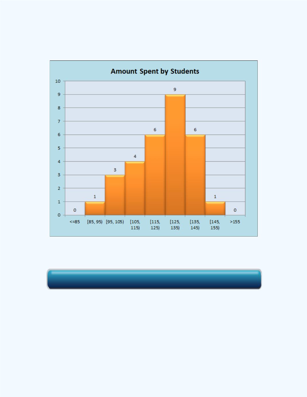
Figure 1-11:
Histogram for the money spent for the
Information in
Example 1-3
One can extract the information from
Figure 1-11
to help in constructing a
group frequency distribution. The frequency count for each class is given at
the top of the vertical bars. A grouped frequency distribution for the data
using seven classes is given on the left side of the output in
Figure 1-11
and
is presented in
Table 1-5
. Observe, for instance, that the upper limit value
for the first class and the lower limit value for the second class have the
same value of 95. The value of 95 cannot be included in both classes, so the
Click here for the Histogram with Table from Raw Data Workbook