


 59 / 762

Chapter 1: Introduction and Graphical Displays
59
categories in the data set. If the number of categories is very large for either
quantitative or qualitative data, the pie-chart would not be ideal to display
such types of data since a large number of sectors will convolute things and
make it difficult to read information displayed on the graph.
Definition: Pie Chart
A pie chart or a pie graph is a circular display that is divided into sectors
(classes) according to the frequency or percentage of data values in each
class.
Note:
A pie chart allows us to observe the proportions of the classes relative
to the entire data set.
Pie charts are readily used to display qualitative data.
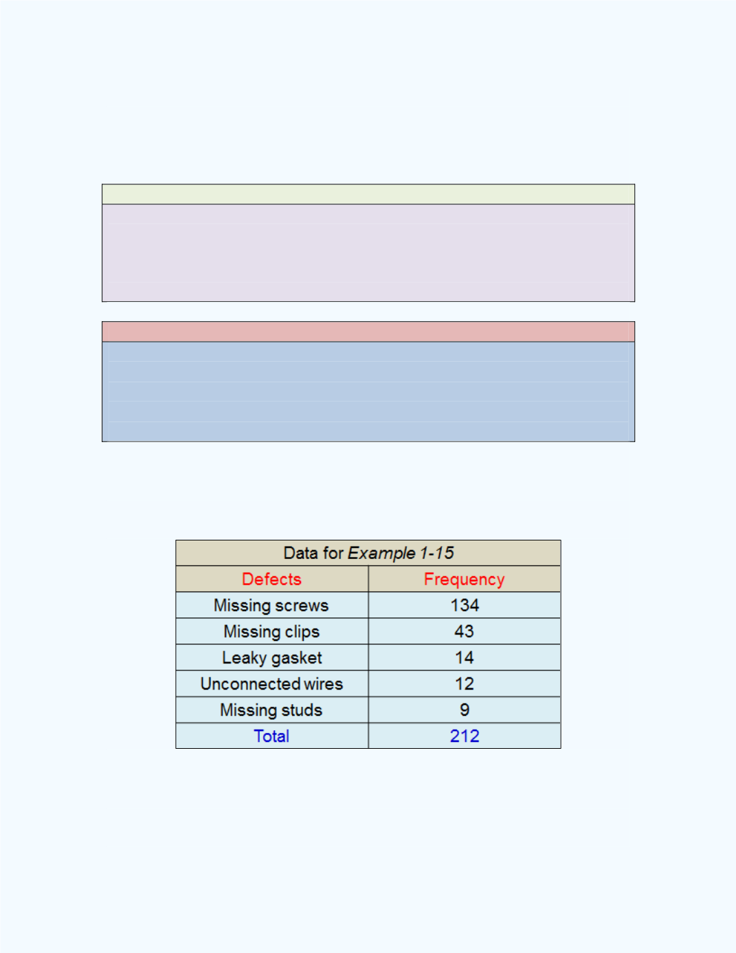
Example 1-15
: The following information over a six month period,
relating to the number of defects in a manufacturing process in a company,
was obtained by the quality control team. Present a Pie chart for the data.
Solution:
The pie chart for the data is presented in
Figure 1-29.
You can
produce
Figure 1-29
with the
Pie Chart for Table Data
workbook.
Observe that this workbook is set up to accept a table of values.