


 62 / 762

62
Chapter 1: Introduction and Graphical Displays
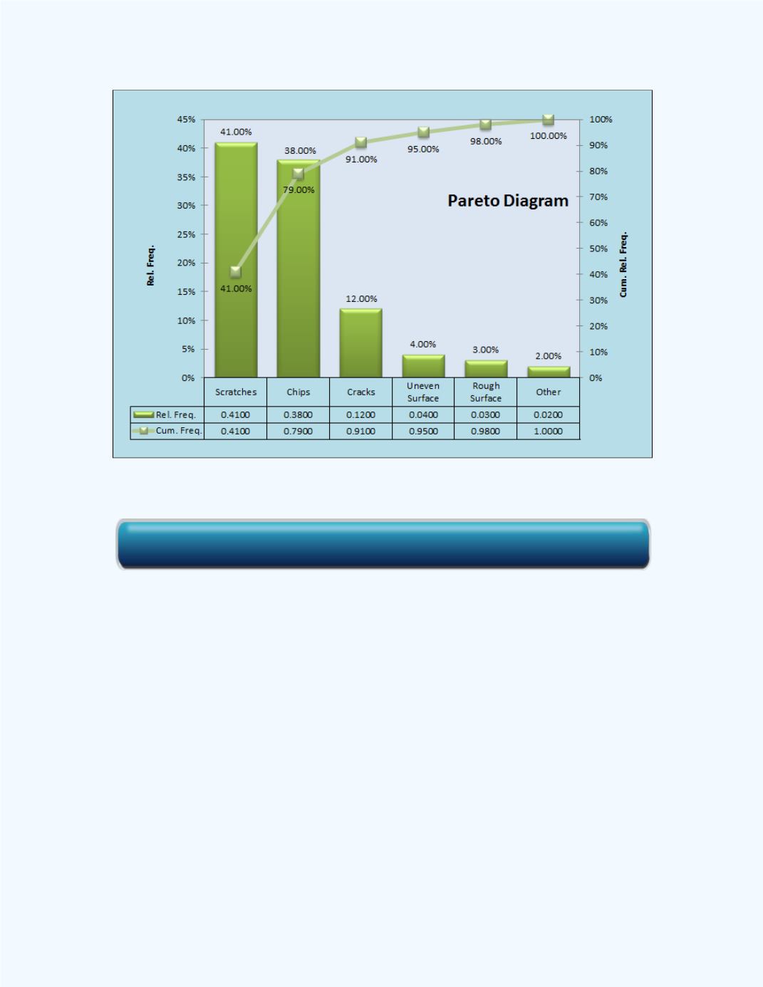
Figure 1-30:
Pareto chart for the data in
Example 1-16
Observe that the categories have been ordered from the highest percentage to
the lowest percentage with the categories of scratches, chips, and cracks
making up the critical few categories. Thus one would have to pay attention
to the process and try to identify where these defects are being produced.
Also given in the figure is a table with the relative frequencies and the
cumulative relative frequencies for each category. Observe that the critical
few categories of scratches, chips, and cracks account for 91% of the
defects. The values on the cumulative relative frequency are displayed as
percentages on the right vertical axis of the graph.
Summary
The graphical displays discussed in this chapter can be investigated through
Technology
Click here for the Pareto Charts for Defects Workbook