


 61 / 762

Chapter 1: Introduction and Graphical Displays
61
1-11 Pareto Charts
Pareto charts are useful displays when we would like to determine which of
the categories make up the critical few and which categories make up the
insignificant many for a given data set. For instance, in manufacturing,
quality control officials usually would like to determine which defects in a
process make up the critical few such that steps could be taken to correct the
process in order to eliminate or significantly reduce such defects.
Definition: Pareto Chart
A Pareto chart is a type of bar chart in which the horizontal axis represents
categories in the data set when the bars are ordered from largest to smallest
in terms of frequency counts for the categories.
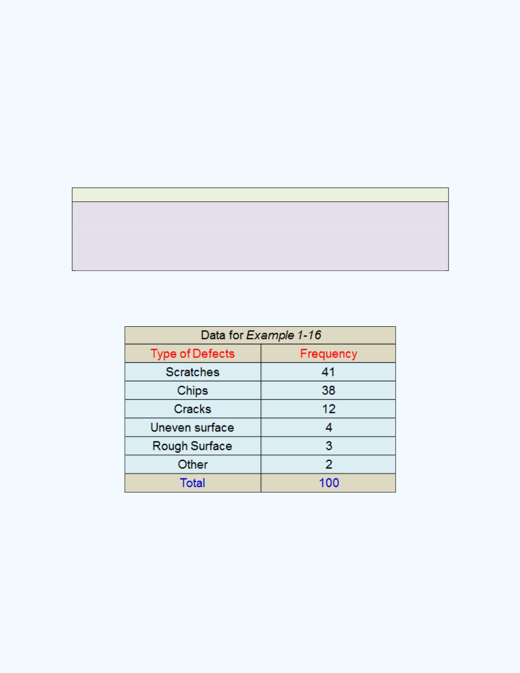
Example 1-16
:
Display a Pareto chart for the following defects found on a
sample of granite counter tops.
Solution:
The Pareto chart for the data is shown in
Figure 1-30
. This
graph can be produced with the
Pareto Chart for Defects
workbook. You
may have to unprotect the sheet in order to insert the percentages for each
category and the cumulative percentages along the vertical axes as shown in
Figure 1-30.