


 56 / 762

56
Chapter 1: Introduction and Graphical Displays
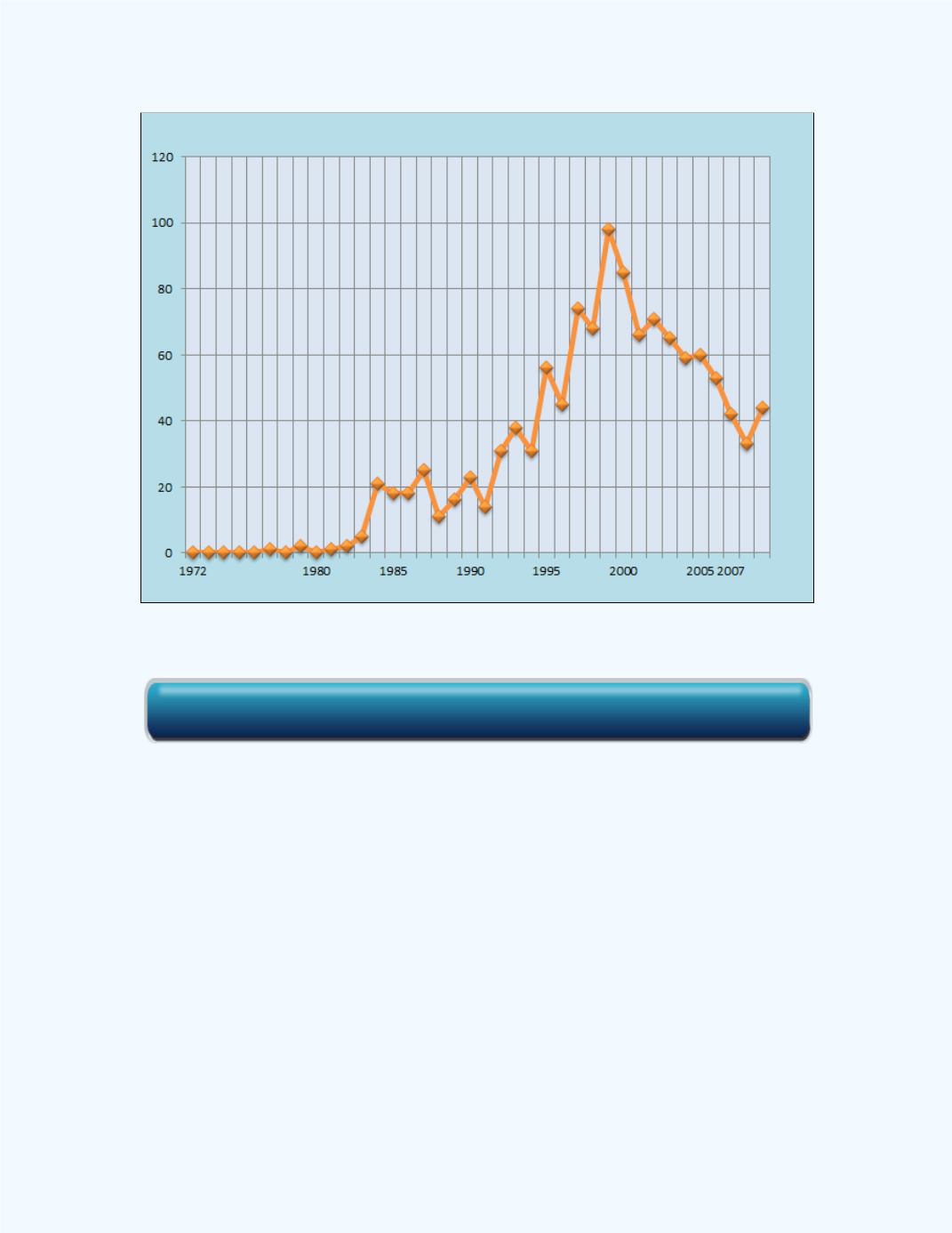
Figure 1-26:
Time series plot for
Example 1-13
Observe from the graph that the highest number of executions occurred in
1999. There was an upward trend up to that point and then the number of
executions in the USA declined.
Sometimes we would like to compare two variables over the same time
period. We can use the
Time Series Plot for Two Variables
workbook to
compare the two data sets over time.
Example 1-14:
The data for this plot in
Figure 1-27
can be found at the
listed site. The data at the site shows the average SAT Mathematics Scores
for males and females from 1972 to 2008. The data is presented as a time
series graph showing how the scores vary over time for both the male and
female students.
Click here for the Time Series Plot for a Single Variable Workbook