


 89 / 762

Chapter 2: Measures of Central Tendency
89
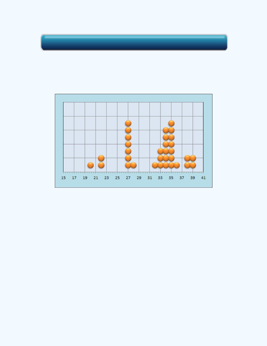
The plot shows that there are two modes in the data set whose values are 27
and 35.
The dot plot shown in
Figure 2-28
supports the results in
Figure 2-27
.
Figure 2-28:
Dot Plot for
Example 2-10
Sometimes we are presented with group data in which we would have lost
information because the data has been summarized. In such cases, we speak
of the
modal class
for the presented information. This will be the class with
the highest frequency count.
Figure 2-29
shows the histogram with five classes for the data given in
Example 2-5
. Observe that the class with highst frequency is [990, 1090).
Thus, this will represent the modal class for the data based on the given
histogram.
Click here for the Basic Statistics Workbook